It's late to be posting this, but I wanted to include a little send-off, since yesterday was officially the last day of the semester for me.
I enjoyed this class! Yes, learning the new software is an ongoing struggle, and the work itself could be challenging, but this ended up being my favorite class of the semester! I may not be a graphic design major, but I know that I can take what I've learned here through the rest of my life; hopefully by creating packaging/cover designs for some of my own work in the future. And more importantly, I feel inspired. I have lots of ideas that I want to try out, new techniques to experiment with, renewed drive to improve myself. It's refreshing.
In particular, I was happy with my work on the book cover. This project felt the closest to something I'd want to do for myself and I was finally able to get myself to do something more clean and minimal, just like I was hoping way back at the start of the semester. Yay, goals accomplished! Personal growth! Shouting!
What about you guys? Do you feel like you grew as artists? Did you have fun? I hope so!
Have a great winter break, everyone!
Saturday, December 14, 2013
School Graffiti
What do you think of the graffiti that occasionally shows up around the school, especially in the art building? Lately I've been taking photos when I notice ones I like, unfortunately I can't post them here because of my computer crash. I might be able to recover the photos, I just can't count on getting that done soon.
But I can still tell you about them. In particular, there was a piece signed "Banksy" on the second floor of the stairwell in the Art Building of a smoking fish. This is what first got me to start looking out for and making note of school graffiti. I passed by it almost every day for weeks, so it should still be there. The only change I noticed was that someone wiped off "Banksy" and wrote "No!" shortly after it first popped up. Not sure why, maybe they thought whoever posted it was a poseur?
Another which I only noticed yesterday, but I doubt can stay up long: on the main crossing area between the student center block and the library/general classroom building/art building block, someone tagged the stick figure sign. They painted little black wings on the stick figure and attached a can of Red Bull to his hand. I though it was funny. But again, this one's up in a very public area on a street sign, so I doubt it can stay up nearly as long as the stairwell fish.
Those are the main two that really caught my attention, and I hope you can catch them before they're taken down!
Tuesday, December 10, 2013
Even More Games!
Okay, had to do one more: Psionic Games.
It's just one guy in the UK who goes by Si, and he apparently makes everything in the games himself. That alone is impressive. All of his games are CGI as opposed to the hand drawn art I love from Hyptosis and Pastel, and while CG doesn't hold the same place in my heart I can't help but appreciate the details Si puts into everything.
BE WARNED: most of Si's games (okay, most of the ones that I like) are horror games, and they include the occasional jump scare. If you're sensitive to that, you might want to skip this. My personal favorite of his are the Ghostscape games. You have to adventure alone through creepy settings, collecting evidence to put together the mystery of what is haunting the place. Going back and forth trying to collect everything can be a little frustrating, but it also gets you to really appreciate the world that was created.
But wait, if you just don't care much about playing games, his website is still worth a look. Because he's devoted to working on every aspect of his games himself and has built up so much, there's a lot of free 3D models, textures, sounds, etc. that he provides for other artists to use! That is awesome to me!
So, with that said, I've really got to start working on something of my own. There's no excuse now, it's something I've been wanting to do for a long time. The only questions are: Just what is feasible for me with my current skill level? and What do I want to make? I find these questions difficult to tackle, which might be partly why I've waited so long. Once I can answer them, though, the rest should come easy.
So, thoughts? Comments? I know you've only seen a little of my style and what I can do, but I'd love to see what everyone thinks!
More Games!
Well since I wrote one review, why not another?
Another inspiration for me to start working on my own games are the people over at Pastel Games. They've made a few generic, but very cute point-and-click escape games, but what originally got me following them was their Daymare Town series. Seriously, just open one of those games and look at it. They're set in this Dr. Seuss-like world, all the art is just hand drawn, plain black and white, but so wonderfully weird. It's the minimalistic soundtrack, though, that makes the games just a bit unsettling (in a good way). Be warned, like a Seuss story, the games run on their own weird logic, so don't feel bad if you have to refer to a walkthrough to finish. I'm more appreciative of the art than the gameplay anyway-not that it's bad, that's just my taste.
But they have quite a few more series that kept me hooked. The one I'm most crazy about right now is The Fog Fall, a story-based adventure game set after a nuclear war. Can't wait for the next in this one! There is a larger story to it, but we have to take our time getting there. In the meantime, I appreciate the visuals of the world growing feral, the characters we get to meet along the way, and the lonely mood.
As I said, they've got quite a variety under their belt so try to check out more than what I've mentioned here, but one thing I always look forward to when playing a Pastel Game is the atmosphere. This is especially true of their more serious games; the world of the game feels real, it's all around you, but you just can't see it all. That feeling just makes their creepy series all the more satisfying to me.
C'mon, the winter break is coming, so check out Pastel Games when you have the time!
Games!
I remember at the beginning of the year talking about how I'd like to work on a game. Just a simple one, maybe text-based or point-and-click, but after how crazy this semester was and all the trouble I had with my programming class even that started to seem overwhelming. Still, winter break is approaching, and that always sets my mind toward working on personal projects.
One guy who keeps inspiring me to make my own games is an artist called Hyptosis, on Newgrounds. He's most famous for his work on the creepy yet whimsical Alice is Dead series, but he's done quite a few other games. They vary in tone from slightly dark to very lighthearted, but what really gets me is that he is slowly developing a world for all of his fantasy games to live in. Not just little jokes and references to old games here and there; events in one series are having effects on the events in the others. Aside from the fantasy world, the main thing he sticks to is zombie apocalypse survivor games. Dude loves zombies. Now, I personally found his zombie games a bit hit-or-miss, but I do think everyone should check out his The Sagittarian series. It's a choose your own adventure point-and-click, with a catchy soundtrack and a great, surprisingly complex story.
Wow, I didn't really mean to turn that into a review, but like I said, I admire Hyptosis and I've been following/internet stalking him for a while now. Check him out!
Sketches!
So, I tried to save the sketches that were in my notebook on the disc with the final versions of all my assignments, but whenever I tried it would somehow corrupt the disc and everything would be removed! Weird. Now I've tried to upload some of my sketches here throughout the year, but I just want to try and make sure I've got it all up now.


Project 01: Logos


There are some other sketches from this project that I uploaded here way back when we were working on it, so I'm not worried about putting them up a second time.
Project 02: Ads


Project 03: Event Poster
Pretty much all of my sketches for this project were done on spare paper outside my notebook, so I turned them in this morning along with my sketches of the final project.
Project 04: Book Cover
Just like with project 3, most of the sketches for this one were done on spare paper, which I turned in this morning, and I know I uploaded them here, too.
Project 05: Packaging
And finally, our last project. I turned in my sketches with everyone else. Some were on spare paper, others in my notebook. Here's the ones from my notebook just because:


Monday, December 9, 2013
Random Discussion
I just felt like bringing this up. For my last project in another class this semester, I'm trying to build a zoetrope. Ever since I found out about them the idea captured me, because I hope to be an animator someday and this is probably the oldest form of animation ever.
It's really simple, though.
What's probably the most amazing thing about them is that, with enough knowledge and creativity, you can make them out of almost anything. Really anything: paper, plastic sculptures...
CAKE!!!
Yes, even cake can become an animation. I feel a whole new world opening up before me...
Final Presentation Tomorrow!
Whew! This has been a long semester for me. I wish I could have gone out on more of a high note, but unfortunately I just don't feel happy with this last project no matter what I do.


Maybe I've just been staring at my own work too long. Can't wait to see everyone's one last time tomorrow morning!
References
I just wanted to include some of the Art Nouveau advertisements and some of the reference pictures I've found over the course of this project, maybe they could be useful to someone else, too.


 Also, wow! If I need two blog posts per week, I need a total of 32, which means I still need 6 more posts! I didn't think I was so behind!


Sunday, December 8, 2013
Final Project: Packaging
Wow, I really slipped behind on my blog updates! I kept meaning to log on over the Thanksgiving break, but I guess I just got distracted by food-erImean bonding with my dear family. Yes, that's it. Delicious bonding.
Anyway, this is the package I chose to redesign:

 It's so brown! And if there's one thing I have noticed lately, it's that photos of food on the package rarely look good. So, off I go to redesign!
Anyway, this is the package I chose to redesign:


Tuesday, November 19, 2013
Past Student Worth Checking Out
I want to make sure I can remember this girl, not just because she also did a cereal box design, but because her body of work is really interesting!
Check out Lauren Wiginton!
Here's her cereal box design:
 I've already got a few ideas from looking at her design. I'd like to make a window that goes up the length of the box so you can always see how much you have left. I liked her cut-out tab at the top, although if possible I am sticking with my original plan of making some sort of pouring spout on the side. I also hadn't thought much about how to present the nutrition information, but seeing hers I'd like to find a creative way to do it, too.
Check out Lauren Wiginton!
Here's her cereal box design:

Final Project: Packaging Redesign
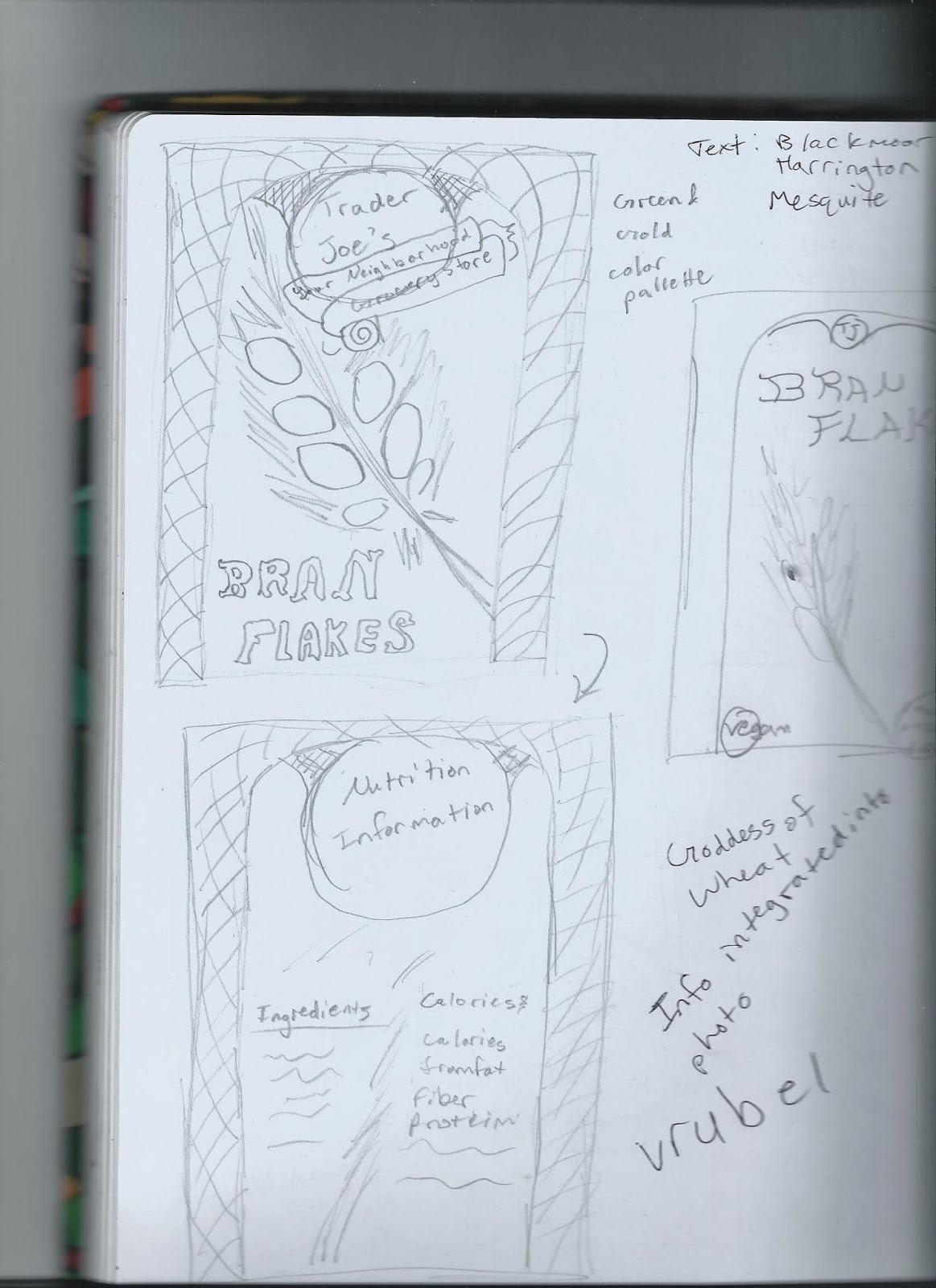
Final Project, WOOO! I'm excited, I really want to do well. So, I'm going to be trying to redesign a Trader Joe's cereal box. I feel it doesn't advertise its health benefits as well as it could, in addition to just being brown, boring, and unattractive. I'd also like to try my hand at the more functional aspect of trying to make the box easier to open, close, and reopen/pour.
So far I'm browsing packaging templates to try to get ideas.
*Random sidenote: has anyone ever seen scallop boxes before? These kind:

 I've just never seen anything like this before, but it looks a little unappealing to me. Kind of a weird way to get the lid to stay on. What do you think?
Of course, once I looked up scallop boxes to find out more (some were better looking/different than this) I ended up finding pictures of actual scallops, and now I'm hungry. Darn.
So far I'm browsing packaging templates to try to get ideas.
*Random sidenote: has anyone ever seen scallop boxes before? These kind:


Of course, once I looked up scallop boxes to find out more (some were better looking/different than this) I ended up finding pictures of actual scallops, and now I'm hungry. Darn.
Book Cover Project Progress
So, after doodling whatever ideas came to mind, I pretty quickly settled on this basic idea:
 Which I later refined:

I had a lot of trouble trying to figure out what to put on the back. I took a break from thinking about that to work on the other aspects of the back cover, like the summary. This is silly to mention, but I ended up writing the summary myself. I know we could have just taken one from anywhere, but I didn't like any of the summaries I found and I wanted to make it interesting, not just presenting it as something everyone already knows.
 I'm actually glad I did, though, because seeing what the cover looked like after that helped me finally decide what to do. It's so nice and clean looking (especially compared to what I normally put out) that it seemed only natural to just continue the flow of the front cover in a simple, unobtrusive way.
So after all that, along with my home computer dying and the ridiculous misadventures with the printer taking a FULL HALF HOUR to print two pages even though they had barely any ink on them, this is the finished product:
 And I'm actually pretty proud of it! Hooray!


I had a lot of trouble trying to figure out what to put on the back. I took a break from thinking about that to work on the other aspects of the back cover, like the summary. This is silly to mention, but I ended up writing the summary myself. I know we could have just taken one from anywhere, but I didn't like any of the summaries I found and I wanted to make it interesting, not just presenting it as something everyone already knows.

So after all that, along with my home computer dying and the ridiculous misadventures with the printer taking a FULL HALF HOUR to print two pages even though they had barely any ink on them, this is the finished product:

Thursday, October 31, 2013
Project Four: Book Cover
For the book cover project, I'll be doing Dracula. I have to say, I'm surprised no one jumped on this one before me!
This book has been around so long, and is so ingrained in pop culture, I'm a bit unsure if that will make it easier or harder on me. On the one hand, there's a lot out there to inspire me. On the other hand, the pop culture image of Dracula is not the same as the actual character in the book. I love the original novel and I'm aware of those differences, but I still want to watch myself to make sure I don't start using stuff that's from the plays, movies, TV adaptations, etc. Here's a few book covers from over the ages that I found:


 Quite a variety! And these are only a few of the many I found just from a quick Google search.
So, what should my approach be? Even though Dracula is considered the star of the show, most of the protagonists are iconic themselves, particularly Van Helsing and Lucy. (But Mina Harker was always my favorite!) I'd like to figure out some way to feature our heroes, if not as prominently.
I'm still iffy on the issue of whether to do a more representational or symbolic cover. Like, illustrate a great scene/character, or build some sort of design that has symbols from the book. I'm leaning towards the latter...
Thoughts?
This book has been around so long, and is so ingrained in pop culture, I'm a bit unsure if that will make it easier or harder on me. On the one hand, there's a lot out there to inspire me. On the other hand, the pop culture image of Dracula is not the same as the actual character in the book. I love the original novel and I'm aware of those differences, but I still want to watch myself to make sure I don't start using stuff that's from the plays, movies, TV adaptations, etc. Here's a few book covers from over the ages that I found:

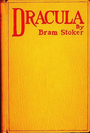


So, what should my approach be? Even though Dracula is considered the star of the show, most of the protagonists are iconic themselves, particularly Van Helsing and Lucy. (But Mina Harker was always my favorite!) I'd like to figure out some way to feature our heroes, if not as prominently.
I'm still iffy on the issue of whether to do a more representational or symbolic cover. Like, illustrate a great scene/character, or build some sort of design that has symbols from the book. I'm leaning towards the latter...
Thoughts?
Poster Critique Version and Updated Version
So, here is the version of my poster I presented for critique:
 And here's a little update where I got rid of that box and played a little with the size and out lines of the font:
 I do like this updated version better. I wish I'd thought of it before I printed!


Wednesday, October 23, 2013
Poster Progress
Here's what I have so far:
 It's still really rough, but I like the direction I'm going in. What really worries me is how much trouble I'm still having with Photoshop. Just getting this done took me way too long.

Tuesday, October 22, 2013
Poster Project Update
So, I think I've got a pretty solid idea of what I want to do. I was playing with this design, and this is sort of the basic color scheme I'm going with.
 Except I plan for the finished product to have a black background, try to make those colors glow (does anyone have good advice on how to accomplish that, by the way?)
 This is the more cleaned-up design that I've chosen. I'm going to trace this sketch more neatly in Photoshop and work from there.
Comments? Advice?


Comments? Advice?
Thursday, October 17, 2013
Poster Project Ideas
Okay, new project! I've only come up with a few events and sales I might do, and so far I'm not sure about any of them:
Edit: Decision made. I'm doing Garden Lights!
- Garden Lights Holiday Nights at Atlanta Botanical Gardens
- Go West! Exhibition at the High Museum
- The upcoming How to Train Your Dragon sequel (this one probably isn't a great idea, since it's pretty far off and not a lot of material has been released).
- The Hyperbole and a Half book
Edit: Decision made. I'm doing Garden Lights!
Sunday, October 13, 2013
Close to Finished?
I think I've almost got these ads as good as I can make them:
Thoughts?
 |
| 3 x 10.5 |
 |
| 5 x 5 |
 |
| 8 x 10 |
Thursday, October 10, 2013
Changing the Plan (for the better)
Despite my disappointing progress so far, I think I've had a bit of an epiphany on how to improve. I hadn't decided to do this, but I've been trying to take these different elements and fit them together to build a seamless new picture. Considering what I'm trying to go for, letting my image actually look like a collage might be the best direction to go in. So I'm going to just pick patterns that work well with certain teas and cut them into shapes and lines that I can use to build a picture.
I still don't know which tagline to pick, but "Experience the world with Teavana" seemed to pop more than the others, so I'm going to go with something along those lines.
I also like the idea that was suggested to me about putting maps of where the teas are from in the background. So, a lot of crunch work ahead!
Wednesday, October 9, 2013
Ad "Progress"
I am terrible with Photoshop!
I'm not giving up or anything, but all the trouble I've been having just getting the basics down is a bit discouraging. So far, this is all I've got to show for myself:
 Still, better than nothing, right? ...riiiight?
Well, in my defense, I had quite a lot of other work I had to finish right away, and once that was done it was either try to fix this thing I'm not even sure I'll stick with or try to get three hours of sleep. I stand by my decision.
I do think I understand what to do better now, and thankfully I've still got the weekend to work. I think I should play with my composition ideas again if I want this to look good.
I'm not giving up or anything, but all the trouble I've been having just getting the basics down is a bit discouraging. So far, this is all I've got to show for myself:

Well, in my defense, I had quite a lot of other work I had to finish right away, and once that was done it was either try to fix this thing I'm not even sure I'll stick with or try to get three hours of sleep. I stand by my decision.
I do think I understand what to do better now, and thankfully I've still got the weekend to work. I think I should play with my composition ideas again if I want this to look good.
Tuesday, October 8, 2013
Project Two Step Four
In my research on Teavana, I've had some trouble finding ads besides the ones that occasionally come up on my banners after looking them up on the Internet myself. That makes sense, in retrospect, as I even found an article on the company stating that their business strategy relies on "virtually no advertising," instead focusing on tea culture, mall foot traffic, and word of mouth. Well, it does seem to be working for them.
So, I decided instead to pick some images from their site as examples of their advertising.


 I like their style: clean, crisp, and colorful, everything looks beautiful and tasty. Still, you're not likely to see it unless you know about them already. I don't like to be swamped with ads any more than the next person, but I believe they would benefit from more exposure.
I get a similar feeling watching the videos on their YouTube channel: the people they have to speak seem to know their stuff and some viewers love the real-person appeal, but for that same reason they can come off looking a bit unprofessional compared to ads with actors and professional speakers.
Since Teavana doesn't have their own tagline, I've been playing around with some that I hope will be good:
So, I decided instead to pick some images from their site as examples of their advertising.


I get a similar feeling watching the videos on their YouTube channel: the people they have to speak seem to know their stuff and some viewers love the real-person appeal, but for that same reason they can come off looking a bit unprofessional compared to ads with actors and professional speakers.
Since Teavana doesn't have their own tagline, I've been playing around with some that I hope will be good:
- Tea can transport you.
- Tea can take you there.
- Travel the world in a cup.
- Entire worlds in one cup.
- An entire world in a cup.
- Drink in the world.
- Experience the world with Teavana.
- Tastes of the world from Teavana.
Subscribe to:
Posts (Atom)