I want to make sure I can remember this girl, not just because she also did a cereal box design, but because her body of work is really interesting!
Check out Lauren Wiginton!
Here's her cereal box design:
I've already got a few ideas from looking at her design. I'd like to make a window that goes up the length of the box so you can always see how much you have left. I liked her cut-out tab at the top, although if possible I am sticking with my original plan of making some sort of pouring spout on the side. I also hadn't thought much about how to present the nutrition information, but seeing hers I'd like to find a creative way to do it, too.
Tuesday, November 19, 2013
Final Project: Packaging Redesign
Final Project, WOOO! I'm excited, I really want to do well. So, I'm going to be trying to redesign a Trader Joe's cereal box. I feel it doesn't advertise its health benefits as well as it could, in addition to just being brown, boring, and unattractive. I'd also like to try my hand at the more functional aspect of trying to make the box easier to open, close, and reopen/pour.
So far I'm browsing packaging templates to try to get ideas.
*Random sidenote: has anyone ever seen scallop boxes before? These kind:
I've just never seen anything like this before, but it looks a little unappealing to me. Kind of a weird way to get the lid to stay on. What do you think?
Of course, once I looked up scallop boxes to find out more (some were better looking/different than this) I ended up finding pictures of actual scallops, and now I'm hungry. Darn.
So far I'm browsing packaging templates to try to get ideas.
*Random sidenote: has anyone ever seen scallop boxes before? These kind:
I've just never seen anything like this before, but it looks a little unappealing to me. Kind of a weird way to get the lid to stay on. What do you think?
Of course, once I looked up scallop boxes to find out more (some were better looking/different than this) I ended up finding pictures of actual scallops, and now I'm hungry. Darn.
Book Cover Project Progress
So, after doodling whatever ideas came to mind, I pretty quickly settled on this basic idea:
Which I later refined:
I had a lot of trouble trying to figure out what to put on the back. I took a break from thinking about that to work on the other aspects of the back cover, like the summary. This is silly to mention, but I ended up writing the summary myself. I know we could have just taken one from anywhere, but I didn't like any of the summaries I found and I wanted to make it interesting, not just presenting it as something everyone already knows.
I'm actually glad I did, though, because seeing what the cover looked like after that helped me finally decide what to do. It's so nice and clean looking (especially compared to what I normally put out) that it seemed only natural to just continue the flow of the front cover in a simple, unobtrusive way.
So after all that, along with my home computer dying and the ridiculous misadventures with the printer taking a FULL HALF HOUR to print two pages even though they had barely any ink on them, this is the finished product:
And I'm actually pretty proud of it! Hooray!
Which I later refined:
I had a lot of trouble trying to figure out what to put on the back. I took a break from thinking about that to work on the other aspects of the back cover, like the summary. This is silly to mention, but I ended up writing the summary myself. I know we could have just taken one from anywhere, but I didn't like any of the summaries I found and I wanted to make it interesting, not just presenting it as something everyone already knows.
I'm actually glad I did, though, because seeing what the cover looked like after that helped me finally decide what to do. It's so nice and clean looking (especially compared to what I normally put out) that it seemed only natural to just continue the flow of the front cover in a simple, unobtrusive way.
So after all that, along with my home computer dying and the ridiculous misadventures with the printer taking a FULL HALF HOUR to print two pages even though they had barely any ink on them, this is the finished product:
And I'm actually pretty proud of it! Hooray!
Thursday, October 31, 2013
Project Four: Book Cover
For the book cover project, I'll be doing Dracula. I have to say, I'm surprised no one jumped on this one before me!
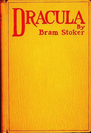
This book has been around so long, and is so ingrained in pop culture, I'm a bit unsure if that will make it easier or harder on me. On the one hand, there's a lot out there to inspire me. On the other hand, the pop culture image of Dracula is not the same as the actual character in the book. I love the original novel and I'm aware of those differences, but I still want to watch myself to make sure I don't start using stuff that's from the plays, movies, TV adaptations, etc. Here's a few book covers from over the ages that I found:
Quite a variety! And these are only a few of the many I found just from a quick Google search.
So, what should my approach be? Even though Dracula is considered the star of the show, most of the protagonists are iconic themselves, particularly Van Helsing and Lucy. (But Mina Harker was always my favorite!) I'd like to figure out some way to feature our heroes, if not as prominently.
I'm still iffy on the issue of whether to do a more representational or symbolic cover. Like, illustrate a great scene/character, or build some sort of design that has symbols from the book. I'm leaning towards the latter...
Thoughts?
This book has been around so long, and is so ingrained in pop culture, I'm a bit unsure if that will make it easier or harder on me. On the one hand, there's a lot out there to inspire me. On the other hand, the pop culture image of Dracula is not the same as the actual character in the book. I love the original novel and I'm aware of those differences, but I still want to watch myself to make sure I don't start using stuff that's from the plays, movies, TV adaptations, etc. Here's a few book covers from over the ages that I found:
Quite a variety! And these are only a few of the many I found just from a quick Google search.
So, what should my approach be? Even though Dracula is considered the star of the show, most of the protagonists are iconic themselves, particularly Van Helsing and Lucy. (But Mina Harker was always my favorite!) I'd like to figure out some way to feature our heroes, if not as prominently.
I'm still iffy on the issue of whether to do a more representational or symbolic cover. Like, illustrate a great scene/character, or build some sort of design that has symbols from the book. I'm leaning towards the latter...
Thoughts?
Poster Critique Version and Updated Version
So, here is the version of my poster I presented for critique:
And here's a little update where I got rid of that box and played a little with the size and out lines of the font:
I do like this updated version better. I wish I'd thought of it before I printed!
And here's a little update where I got rid of that box and played a little with the size and out lines of the font:
I do like this updated version better. I wish I'd thought of it before I printed!
Wednesday, October 23, 2013
Poster Progress
Here's what I have so far:
It's still really rough, but I like the direction I'm going in. What really worries me is how much trouble I'm still having with Photoshop. Just getting this done took me way too long.
Subscribe to:
Posts (Atom)